First Impressions & Suggestions

Been running on an Oculus Rift S & everything is going swell so far. Of all the VR modeling / drawing apps I have tried, this is the only one that works how I like. Then again, might be biased by my love of sketchup.
That in mind, I have some suggestions:

  • The force required to pull the trigger makes it a bit harder to aim precisely, which can be a pain in some situations especially the way sketchup snapping works. I have seen some apps use the forward buttons Y & B for that function instead.

  • For the oculus controler, I found the line tool to be pointed at an awkard angle compared to the controller. I suggest either altering the angle, or changing the model to one which does not evoke dissonant muscle memory.

  • Far to much movement is required to select tools. There are lots of ways you could fix this. I would not make the icons smaller as some have suggested because that will increase the mental effort required to locate a given tool, which is important when we can expect someone to use said tool hundreds of times per session.
    My suggestion is to add an alternate quick access menu. This menu could cover the 8 most common command, or maybe be configurable. 4 command could be allocated to each wrist. The quick access menu would be opened by moving the controller slightly backward with the main menu open. This would cause a ring of 4 quick items to appear around the wrist. Make this bit very responsive so that only a small movement & release of the menu button is required to activate the quick tool.
    Assign a unique tone to each quadrant of the quick menu so that user does not need to waste time checking they got the right tool.
    We don’t want to assign more than 4 quick actions per wrist because the idea is that an action can be selected without distracting the user making sure they got the right one. Also you can only make so many distinct sounds.
    I think I could use the in app tools to model an example & record a video? Will get back on that.

Final most important suggestion. don’t hide the dimension entry inside a menu. It should pop up the moment you start a feature & should read the current value. If you then tap the entry with your off hand it should pop up the numpad.
I really dislike that a feature is not visible as you are entering the dimensions. As you enter the dimensions, the feature should update with the boxes current value every second or so. That way you can see what you are doing.

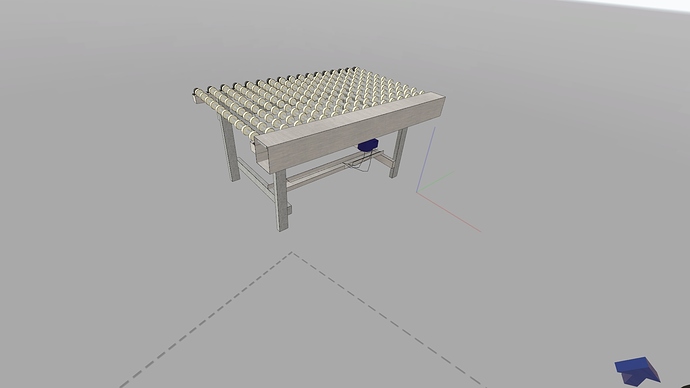
Ok, spent a couple hours tonight trying to make something serious.


The speech to dimensions was very useful, but If I don’t talk really fast then it quits the action. This was not much of a problem with lines, but with things like rectangles it got pretty annoying. Maybe pause action timeout if voice is detected?
My other main gripe is with the move tool.
In the move tool you can select a number of copies to make, but it only gives a few options for # of copies. Could we break that out into a text field to make an exact choice?
Same with number of sides in a circle.

I found the VR workflow made it much easier to precisely erase useless geometry from inside components. For instance, for the roller bearings I was able to zoom until my head was inside them and the controller allowed precise selection of geometry to delete.

Most of my suggestions in the previous post hold, but I did realize (silly me) that most screens do persist in 3d. Don’t recall why I thought they did not.
Also, found the spot in settings where you can reduce menu scale.

Finally, is there any potential to support section planes?

PS. Can we disable movement / scaling of physical cameras? I want to be able to make fancy videos of zooming in and out of my model, but the camera moves when I zoom.
PPS. Did not bother me much, but for some reason I am in the warehouse when I start but after placing a couple bits of geometry it randomly switched to the plain of featurelessness.

Thanks for your detailed suggestions! I’ll try to answer each of them in order.

“”“The speech to dimensions was very useful, but If I don’t talk really fast then it quits the action. This was not much of a problem with lines, but with things like rectangles it got pretty annoying. Maybe pause action timeout if voice is detected?”""

We know that the speech recognition is a bit too slow to be really useful. I’m not sure what you mean with “action timeout” though. There is no timeout at all in VR Sketch as far as I know…

“”“In the move tool you can select a number of copies to make, but it only gives a few options for # of copies. Could we break that out into a text field to make an exact choice?”""

The idea is that if you want a “rare” number like 13, then you pick “12” in the menu and then scroll the value up to 13—or scroll all the way to 13 from the starting 0. “Scrolling” should work on Oculus Rift by using the joystick.

“”“is there any potential to support section planes?”""

I guess you missed the Section Pane tool, which is above the Tape Measure tool.

“”“PS. Can we disable movement / scaling of physical cameras? I want to be able to make fancy videos of zooming in and out of my model, but the camera moves when I zoom.”""

Thanks, I’ll look into that.

“”“PPS. Did not bother me much, but for some reason I am in the warehouse when I start but after placing a couple bits of geometry it randomly switched to the plain of featurelessness.”""

It switches out of the warehouse when the model is moved or scaled in such a way as it no longer fits (e.g. when moved down so that parts of it are below the floor). The warehouse only reappears if you choose “Back to Warehouse” in the menu from the Teleport tool. In older version the warehouse would reappear as soon as it would again fit around the model, but we found that it was even more confusing to have the warehouse appear and disappear repeatedly. The current solution is better but admittedly still not ideal.

“”" The force required to pull the trigger makes it a bit harder to aim precisely, which can be a pain in some situations especially the way sketchup snapping works. I have seen some apps use the forward buttons Y & B for that function instead."""

I see the point, but I’m not sure that clicking on the Y/B button is really better. Note that for precise movement you don’t have to release the trigger all the way; it’s enough to release it a little bit after you’ve pressed it, and then it can be pressed again. Admittedly it’s not a perfect solution either, as it requires constant application of a force in the index finger, which decreases precision on its own. The main problem is that the Y/B button is already used for something else, otherwise we could try making it a duplicate for the trigger button…

“”“For the oculus controler, I found the line tool to be pointed at an awkard angle compared to the controller. I suggest either altering the angle, or changing the model to one which does not evoke dissonant muscle memory.”""

I’m unsure about this one: the line goes “flat” from the flat surface with the buttons. If the line would instead shoot at the angle of the controller body (i.e. orthogonal to the circle in front of the controller) then it would IMHO be going too high. But maybe the real problem is this circle: we have developed it with the old Oculus Rift (not S) controllers, where the circle is below the controller instead of above. This circle hides stuff in front of the controller and should likely be hidden instead, which we’ll try to do now. Then we’ll see how it works for the lines in this new situation.

“”“Final most important suggestion. don’t hide the dimension entry inside a menu. It should pop up the moment you start a feature & should read the current value. If you then tap the entry with your off hand it should pop up the numpad.”""

I think it’s how it works already. Dimensions show up as floating text, and you can click on them (with the other hand) in order to pop up the numpad directly. The menu item is an alternative way to get the same thing (maybe we shouldn’t put the menu item at all, but I like it personally because I’m used to edit with a single controller instead of two of them, and then I don’t get the choice of clicking with the other controller). Maybe information about this should be given somehow?

“”“I really dislike that a feature is not visible as you are entering the dimensions. As you enter the dimensions, the feature should update with the boxes current value every second or so. That way you can see what you are doing.”""

Right, good point.

Overall, thanks a lot for the feedback! It’s very useful to us.

“We know that the speech recognition is a bit too slow to be really useful. I’m not sure what you mean with “action timeout” though. There is no timeout at all in VR Sketch as far as I know…”

  • Ok, thats a problem then. This it actually my most frustrating complaint atm. Say I am creating a rectangle. I trigger once to set the first point, then I say “12.4 meters” and one side snaps to 12.4 meters just fine, but then I try to set the next dimension and half way through talking the action cancels. It acts exactly as though I pressed the cancel action button but I did not.
    It also does this if I start a rectangle and just sit there for a bit, which is why I am calling it a timeout.
    It does not happen if I talk fast enough.
    Personally I think that the speech recognition is plenty fast, its just not really not usable if you don’t have your own office XD.

“The idea is that if you want a “rare” number like 13, then you pick “12” in the menu and then scroll the value up to 13—or scroll all the way to 13 from the starting 0. “Scrolling” should work on Oculus Rift by using the joystick.”

  • Ok, did not realize I could scroll there. Maybe add some sort of clickable indicator like some big arrows?

“I guess you missed the Section Pane tool, which is above the Tape Measure tool.”

  • That I did

“It switches out of the warehouse when the model is moved or scaled in such a way as it no longer fits (e.g. when moved down so that parts of it are below the floor). The warehouse only reappears if you choose “Back to Warehouse” in the menu from the Teleport tool. In older version the warehouse would reappear as soon as it would again fit around the model, but we found that it was even more confusing to have the warehouse appear and disappear repeatedly. The current solution is better but admittedly still not ideal.”

  • I think I might prefer to make the warehouse toggleable in settings & just let things clip through the floor. But that is pretty subjective.

“I see the point, but I’m not sure that clicking on the Y/B button is really better. Note that for precise movement you don’t have to release the trigger all the way; it’s enough to release it a little bit after you’ve pressed it, and then it can be pressed again. Admittedly it’s not a perfect solution either, as it requires constant application of a force in the index finger, which decreases precision on its own. The main problem is that the Y/B button is already used for something else, otherwise we could try making it a duplicate for the trigger button…”

  • Maybe play around with switching their functions?
    Trigger could be the tool selection button maybe?
    Small changes here could make big differences for overall usability.

“I’m unsure about this one: the line goes “flat” from the flat surface with the buttons. If the line would instead shoot at the angle of the controller body (i.e. orthogonal to the circle in front of the controller) then it would IMHO be going too high. But maybe the real problem is this circle: we have developed it with the old Oculus Rift (not S) controllers, where the circle is below the controller instead of above. This circle hides stuff in front of the controller and should likely be hidden instead, which we’ll try to do now. Then we’ll see how it works for the lines in this new situation.”

  • I got used to it pretty quick, but it hammering this out could be important when it comes to first impressions. Something to think about.

“I think it’s how it works already. Dimensions show up as floating text, and you can click on them (with the other hand) in order to pop up the numpad directly. The menu item is an alternative way to get the same thing (maybe we shouldn’t put the menu item at all, but I like it personally because I’m used to edit with a single controller instead of two of them, and then I don’t get the choice of clicking with the other controller). Maybe information about this should be given somehow?”

  • I feel like clicking the floating dimensions disrupts my flow. I find that I rarely take full advantage of my off hand. My thought are more along the line of having the numpad pop up as soon as you initiate the action. For rectangles, have both pop up. Position them near the initial point you clicked.
    Idk, I definitely feel there is a better way to do this.

  • Oh! for rectangles (& cube) can you highlight the side that will be dimensioned first when doing voice entry? Maybe just change the color of the relevant lines? I often end up canceling and restarting rectangles because I misjudged which side would get the dimension I said.

“It acts exactly as though I pressed the cancel action button but I did not.
It also does this if I start a rectangle and just sit there for a bit, which is why I am calling it a timeout.”

  • That sounds like a bug. I can’t reproduce it using the HTC Vive headset, though. I’ll try it in a week with an Oculus Rift (not S). Just for information, are you talking about a timeout that occurs while you still hold the trigger pressed (“click-move-release” mode), or not (“click-release-move-click-release” mode)? Like SketchUp, both modes are supported.

“Ok, did not realize I could scroll there. Maybe add some sort of clickable indicator like some big arrows?”

  • I think that with Oculus Touch, the joystick turns green when you can use it to scroll. I should check that and add explicit arrows or something.

“I think I might prefer to make the warehouse toggleable in settings & just let things clip through the floor. But that is pretty subjective.”

  • Ah, I see the point. Maybe it’s indeed a better idea to do as you suggest, and only have the warehouse disappear when we use the teleport tool (which sets the scale to 1:1, after which for models like complete houses it doesn’t make sense to keep the warehouse). Or maybe ignore clipping through the floor, and make the warehouse disappear only if the model clips through the far walls or the ceiling.

Ah, btw, if the rectangle is

A B
D C

where A is the point where you started and C is the current position of the controller, then floating numbers appear on A-B and on B-C. A-B is always the “first” dimension. You know when the roles of B and D in the picture above are reversed: then you would see the floating numbers appear on A-D and D-C. In other words, the “first” dimension is always the one with a floating number attached to A, and the “second” dimension is always the one with a floating number attached to C.

Doesn’t mean your idea of different colors isn’t valid :slight_smile:

  1. Click release move click release. Happens somewhat inconsistently, seems to depend upon movement. Coincides with the controller model disappearing. Tooltips remain in correct place.

  2. Joystick does turn green, but it is kinda hard to notice.

  • Might want to have it change colors when you open the menu instead of after the menu closes.
  • Might want to consider what to do if someone whats to create a circle with a really large number of sides. Maybe have holding down the stick jump up in larger increments if you hold it for a while. Or even just have it jump up at a constant rate if you hold its instead of requiring multiple toggles.
    *Right now increment is mapped to forward on joystick. Can we map it to both forward and right. Similarly map decrement to both backward and left? Accommodate more use styles.
  1. That sounds good

  2. Btw, can we get the correct controller model? I think the one used now was for the rift, but the rift s controller looks different & the dissonance is annoying.
    Maybe making the big circles on the controller partially transparent would look cool.

  3. Can we add the option to set diameter to circle tool?

    1. Ah, if the controller disappears it might be because of it getting disconnected somehow. Even if it’s only temporary, it will force a cancel. Maybe we should not force a cancel if the disconnection is short enough?
    1. I’ll see what I can do to improve the joystick experience…
    1. On my to-do list already :slight_smile: We just made a preliminary Quest version, and the controllers are the same as the Rift S, so it should be easy to port that to the PC version even if I’m not able to directly test the Rift S.
    1. I think that in SketchUp you’d do a 5m-diameter circle by typing “5/2”. You can do the same in VR Sketch, both in the numpad and by voice (“five meters” (pause) “divided by two”).
2 Likes
  1. It can, but fails when using decimals. Wierd

How impossible would it be to support another extension like “MsPhysics”?
In my testing (by rapidly raising & lowering my headset), the position displayed in VR only updates when the simulation is stopped.
“Movable Joints” might be easier since its position updates as soon as you complete an action with its movement tool. Though it is much less interesting.
If its possible at alI I think getting some sort of physics working would give you the currently untapped physics simulator vr playground market.
Speaking of potential markets, I would look into a workflow for converting you sketchup house into an oculus home or VR chat environment & post a detailed tutorial. There are plenty of people who would shell out to be build their own house in vr & import it into oculus / steam home.
Mostly just spitballing things I think would be cool atm.

    1. What are you trying to do exactly? Can you give an example?

MsPhysics: it’s probably hard to get good FPS rates if the physics engine runs on the sketchup side and we need to transfer all data every frame over a socket connection using Ruby code. My guess is that MsPhysics doesn’t try to update the sketchup model every frame, either, but renders things directly when animating. That makes it close to impossible to integrate. At best we could redo something very similar on the VR Sketch side, but that’s quite a lot of work.

Workflow for converting to Oculus Home or VR Chat: yes, it definitely looks interesting.

My specific use case is a complex linkage for a puppet leg I am working on that I think would be easier to do if I could move the parts around in vr while I work on them.
Tooling around with MsPhysics for a bit though, it is a bit overkill / overcomplicated.
What I need is less of a physics engine & more of a constraint solver.
The “movable joints” extension seems more like what I am looking for user interface wise, but it just forms a tree of parent > child relationships and moves the children of the selected group. To move linkages you need some sort of constrains solver.

[ Feature Request ]
Ability to enter fractional values in the numpad (division symbol is replaced by backspace once first character is entered)
[ Feature Request ]
Ability to switch units in numpad between metric / imperial. Was pleasantly surprised that voice supported this, but voice is to wibbley to do it consistently.
[ Optimization Idea]
Maybe it would help to have an option to auto hide/unhide group/components based on their longest dimension vs scale. Of course need to remember what stuff is manually hidden.

Ability to enter fractional values in the numpad: noted, will be added!

Ability to switch units in numpad between metric / imperial: so far we follow the configuration in SketchUp. If you go to Windows, Model Info, Units, then you can change that setting per model. If you pick something else than Decimal, the numpad will follow accordingly.

Maybe we could add both of these in a “more options” or “advanced mode” setting for the numpad.

Optimization idea: we already hide groups that are too small, at least when you view the model at a lower-than-1:1 scale. But maybe you have a point that the ratio should be configurable.

The difference is that on the desktop I can just type 10mm or 10" to specify my units regardless of the default unit. Can’t do that with the numpad.
Hiding it behind a menu would add way to many actions to a really common workflow.

I am a bit doubtful that it’s “really common” to want to enter numbers in several incompatible units—but I can accept that it’s occasionally useful. What I had in mind was a setting that you activate, or an “expert mode / basic mode” switch in the numpad itself. Once in expert mode, you always get an expanded numpad with these extra options. If you don’t need them any more, you can switch back to basic mode and get a more compact numpad again.

As always, a UI needs to balance adding more and more special-purpose features versus being kept simple, and the “expert mode / basic mode” switch looks like a good solution to me in this case. We try to keep the integration with SketchUp as close as possible, but having a UI that makes sense in VR is even more important. For some aspects it’s closer to a smartphone than a desktop (like the absence of a real keyboard).

This option of using VR sketch in Quest is great, especially if used in collaboration mode.

Hi everybody,

this is my first post and I thought this may be the right place. We have started with VR just a couple of days ago with the intention to bring our Sketchup models into virtual reality. We are using the Oculust Quest for this purpose. It showed to be a very good solution - special thanks to VR Sketch!

Overall it is just great: stable, performant and versatile. The reactions of people using the glasses with VR-Sketch on it are really fantastic!

However, on “first sight” I found some topics for improvement (or learning, if I just did not get by now).

Shown/unshown components in scenes:
I have learned that the scenes feature is relatively new in VR-Sketch, so I do not want to expect too much. We often use scenes to illustrate alternatives in our furniture projects. I.e. a round counter vs. an edgy one. Using VR-Sketch linked to SkechUp on the computer, everything works fine. Once uploaded to the cloud and opened independently from the computer, the scenes are still there but the shown and unshown objects will not change as they would when connected to the computer. Did I do sth. wrong or is it not implemented yet?

Simplified mode:
Our intention using VR and VR Sketch is to let our customers experience their projects in VR - like a walk through the new kitchen, reception area, living room or complete building. The functionality with basically all tools on hand is great but will be used mainly by us creating and optimizing the projects. It would be great to have a sort of “presentation mode” with a limited functionality (e.g. scale) and tool set like teleporter, laser, freehand move - or configurable as stated before:

I believe this will avoid “unwanted actions” by used with besically no experience in using the software or even VR.

That would be it for the moment, thanks again for your great product and best regards

Volker

1 Like

Hi, and welcome! Thanks for your comments.

Shown/unshown components in scenes: indeed, this doesn’t work on the cloud models. VR Sketch records only the position for each scene. When you’re using SketchUp, then the scene change is sent to SketchUp too, and it might cause some components to be hidden or shown—this fact is then sent back to VR Sketch. But this information is not preserved in the cloud models. The scenes can have a number of effects in SketchUp, and we didn’t investigate them so far.

Simplified mode: yes, that’s a good suggestion. Also, it is strange when viewing cloud models to see all the tools when many of them don’t work, so it would be another use case for a reduced tool set. Note that right now, you can set an option (in SketchUp, “VR Sketch -> Configuration…”) to disable all the tools apart from the teleport, but I guess you’re looking for an intermediate solution.

One workaround for the lack visibilty issue with scenes might be to make entirely different copies of your model with the only difference being the things that would be hidden / show, then move between them.

Thank’s for your help!

This will work for most scenarios, but intermediate would be nice…

I thought about that, too. But quickly toggling back and forth would be great. However, connected to the PC it works and that is great enough for the moment!

Hi again,

there is another thing I learned during a customer presentation - bad or no network connectivity will make things complicated.

There are the two possibilities for the Quest, either to connect with the cable and let the computer (if capable) do the rendering or sendig it wirelessly via WiFi or cloud and leave the rendering to the Quest (which I prefer).
I suggest to implement using the cable for quick file transfer to the Quest, then plug off the cable and continue wireless or offline.

This would help to improve the collaboration possiblities when there is neither a high end laptop nor a fast network connection available. This probably is a typical German problem with regard to the network capabilities…

BR

Volker

1 Like